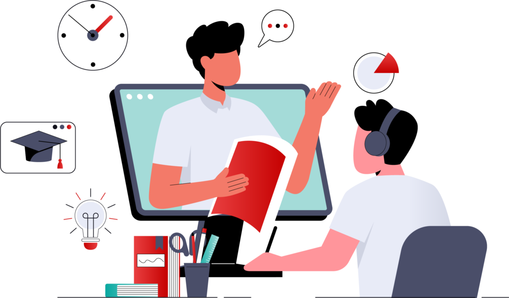
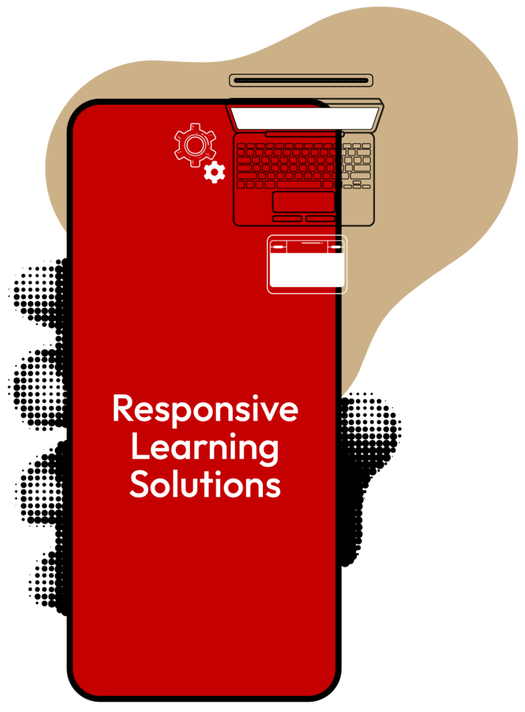
Consistent Training. Any Device. Anywhere.
Today’s learners move across screens starting a course on a laptop, continuing on a tablet, and finishing on a phone. If your training isn’t designed for that, you’re losing engagement. That’s where Ventura’s responsive learning solutions make all the difference. We build eLearning that adjusts dynamically to any device or screen size so your learners experience seamless training, no matter how or where they access it.

Why Go Responsive?
Responsive learning isn’t just about good design it’s about learner convenience, consistency, and performance. Ventura ensures your content is future-ready and frictionless.
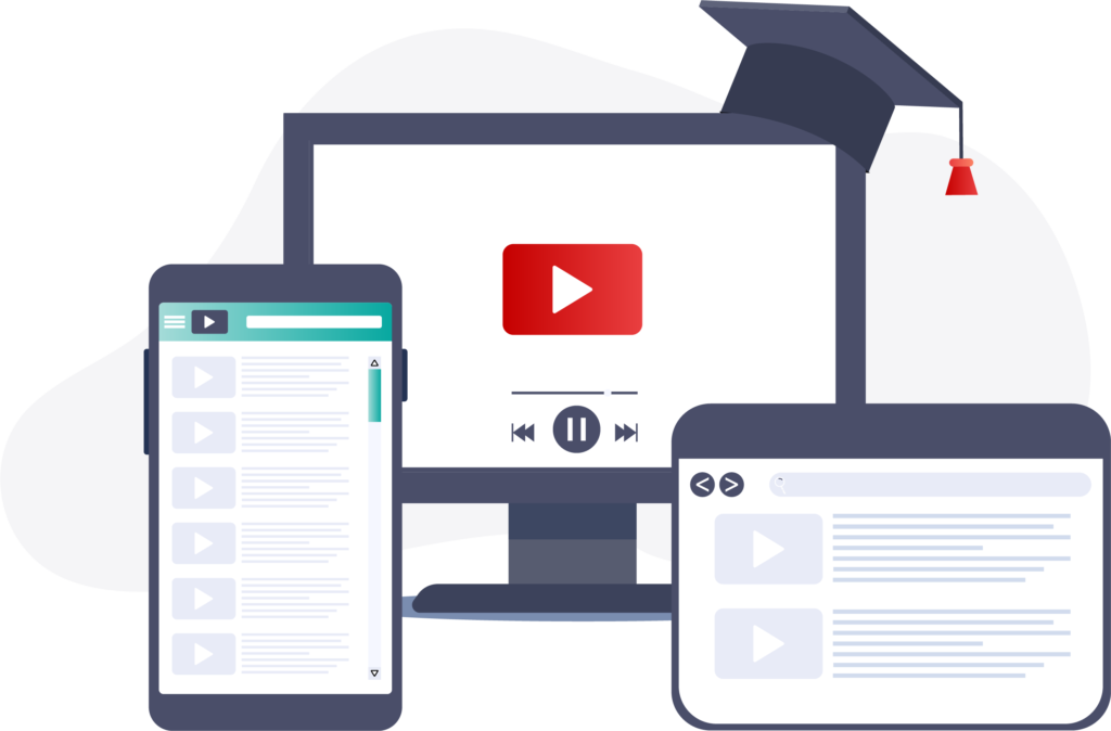
Seamless Learning Across Devices
Learners can pick up right where they left off, no matter the screen.
Increased Engagemen
Responsive design removes barriers, keeping learners focused and active.
Collaborative and Social Learning Support
Optimized for tools that encourage peer interaction.
Better Retention, Better Results
Learning that fits naturally into your team's workflow leads to higher recall.
Cost-Efficient and Scalable
One build works everywhere—saving you time, money, and maintenance.
Designed for How People Learn Today
- Designed mobile-first no retrofitting old content.
- Fully responsive: videos, quizzes, simulations, and more.
- Seamless across devices fluid and intuitive.
- No glitches, no friction just smooth learning.
Perfect for
- Distributed or hybrid teams
- Organizations with a BYOD (bring your own device) policy
- Businesses scaling training across roles, regions, or languages
- Learners who expect intuitive, self-paced learning